1. Public Forms Documentation
  2. Public Form Layouts

Public Forms Documentation

Public Form Layouts

A Public Form Layout lets you define custom HTML that wraps the form fields rendered for a public form action. Instead of the default bare form, you can design a fully branded page — with headers, logos, and styling — while the form fields are injected automatically via the <FormFields /> placeholder.

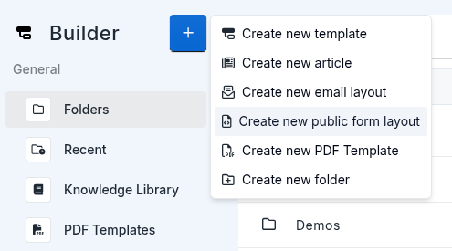
Layouts are managed from the editor under Public Form Layouts. To create one, open the drive and create a new Public Form Layout file.

Once created, link it to an action via the publicformlayoutuuid field in the action's public_form meta:

        
"action_meta": {
  "public_form": {
    "enable": true,
    "publicformlayoutuuid": "your-layout-uuid"
  }
}


The layout has two environments — draft and live — allowing you to iterate on the design and publish when ready.

You can preview a layout directly in the browser without needing a stub. Use the following URL format:

        https://forms.stubber.com/preview/{layout-uuid}?layout_branch=draft
https://forms.stubber.com/preview/{layout-uuid}?layout_branch=live

      
  • layout_branch=draft renders the current draft version of the layout.
  • layout_branch=live renders the published live version.

The layout UUID is shown in the editor when the layout file is open. Preview links are useful for testing the visual design and variable interpolation before linking the layout to an action.

Variables

You can pass variables into the layout via public_form_variables in the action meta. These are interpolated into the layout HTML using {{public_form_variables.key}} syntax.

        
"action_meta": {
  "public_form": {
    "enable": true,
    "publicformlayoutuuid": "your-layout-uuid",
    "public_form_variables": {
      "heading": "Dealer Onboarding Form {{stub.stubref}}",
      "description": "Welcome to Jenny's dealer network! Please fill out the form below to get started"
    }
  }
}


In your layout HTML, reference them like this:

        <h1>{{public_form_variables.heading}}</h1>
<p>{{public_form_variables.description}}</p>


Variable values themselves support Stubber interpolation, so you can embed dynamic values like {{stub.stubref}} directly inside them.

Form and Post-Submit Divs

The layout uses two special id-tagged divs to control what the user sees before and after submission:

  • _stubber_form — contains the form fields and submit button. This is the div that is displayed while the form is active.
  • _stubber_post_submit — contains whatever you want to show after the form is successfully submitted (e.g. a confirmation message, a link, or any custom HTML). You can design this div however you like.

Stubber automatically toggles visibility between these two divs using display: block and display: none — the form div is hidden after submission and the post-submit div is shown in its place.

Custom Submit Button

By default, the form renders a submit button automatically. If you want to provide your own styled button, add a button with the id _stubber_submit_button anywhere inside your layout. When Stubber detects this id, it will use your button instead of the default one.

Example Layout

Here's an example layout using variables for the title and description:

        <style>
  .container {
    margin-top: 20px;
    margin-left: auto;
    margin-right: auto;
    width: 100%;
    max-width: 42rem;
  }

  .card {
    border-radius: 1rem;
    background-color: #ffffff;
    box-shadow: 0 1px 2px 0 rgb(0 0 0 / 0.05), 0 0 0 1px #e5e7eb;
  }

  .card-header {
    border-bottom: 1px solid #f3f4f6;
    padding: 1.25rem 1.5rem;
  }

  .card-header h1 {
    font-size: 1.25rem;
    line-height: 1.75rem;
    font-weight: 600;
    color: #111827;
    margin: 0;
  }

  .card-header p {
    margin-top: 0.25rem;
    font-size: 0.875rem;
    line-height: 1.25rem;
    color: #4b5563;
    margin-bottom: 0;
  }

  .card-body {
    padding: 1.5rem;
  }

  .card-footer {
    border-top: 1px solid #f3f4f6;
    padding: 1rem 1.5rem;
  }

  .card-footer p {
    font-size: 0.75rem;
    line-height: 1rem;
    color: #6b7280;
    margin: 0;
  }

  .submit-button {
    display: block;
    margin: 0 auto;
    width: 100px;
    text-align: center;
    background-color: #2563eb;
    color: #ffffff;
    padding: 0.5rem 1.5rem;
    border-radius: 0.25rem;
    border: none;
    cursor: pointer;
    font-family: inherit;
    font-size: 0.875rem;
    line-height: 1.25rem;
  }

  .submit-button:hover {
    background-color: #1d4ed8;
  }
</style>

<div class="container">
  <div class="card">
    <div class="card-header">
      <h1>{{public_form_variables.heading}}</h1>
      <p>{{public_form_variables.description}}</p>
    </div>

    <div class="card-body" id="_stubber_form">
      <FormFields />
      <button class="submit-button" type="submit" id="_stubber_submit_button">Submit</button>
    </div>

    <div class="card-body" id="_stubber_post_submit">
      <p>Form submitted successfully</p>
    </div>

    <div class="card-footer">
      <p>Need help? Contact support.</p>
    </div>
  </div>
</div>