Builder
The main workspace where users can create and manage their templates
The Builder is the primary workspace in Stubber where you create, edit, and manage templates. It is where you will spend most of your time when defining your processes.
The Builder includes a visual canvas where you can build processes using states, actions, and other supporting tools.
Accessing the Builder
To access the Builder, open the menu in the top-right corner of the screen next to the user icon, then select Builder.
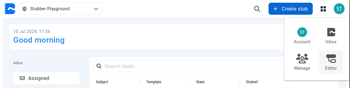
After selecting Builder, you will be taken to the Builder app, where you can manage templates, folders, and related resources.
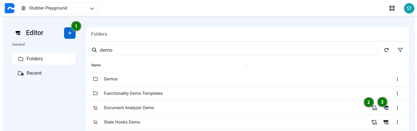
By default, the Builder opens on the folder page, which provides a list of all your templates and template folders.
The sidebar also provides shortcuts to view the organization's most recent templates, Knowledge Library, PDF templates, and StubberDBs.
For each template listed in the Builder, you can perform the following actions:
- Open Stub List
- Opens the list of stubs associated with the selected template.
- Open Overview
- Opens an overview of the selected template.
- Open Default Flow
- Opens the canvas view of the default context of the selected template. See the Canvas section below.
You also have the option to create various components using the plus button in the top-right corner of the screen.
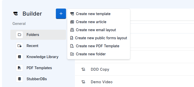
You can create the following items:
- Template — Creates a new template.
- Article — Creates a new article in the Knowledge Library.
- Email Layout — Creates a new email layout that can be used in templates.
- Public Form Layout — Creates a new public form layout that can be used in templates.
- PDF Template — Creates a new PDF template that can be used in templates.
- Folder — Creates a new folder to organize your templates and other items.
Canvas
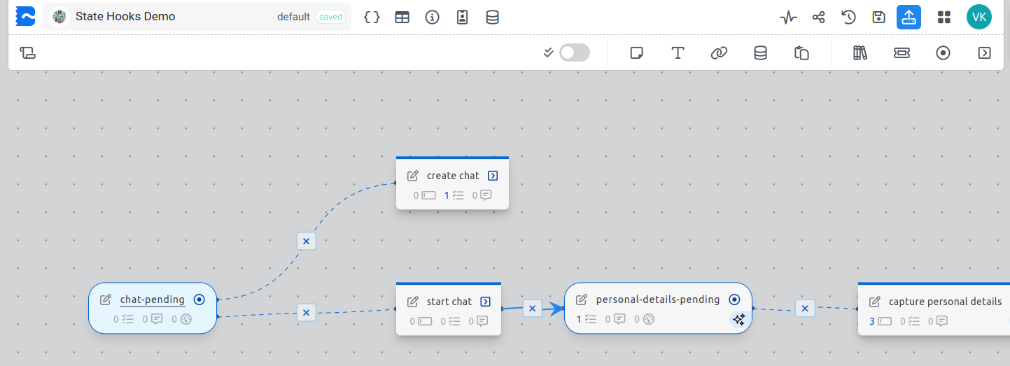
When you edit a template in Stubber, you do so on the canvas.
The canvas is where you add, drag, and connect actions and states to build your template. It is the primary workspace where you will spend most of your time when editing a template.
On the top-most toolbar, you will find the following options, starting from the left:

- The Stubber logo returns you to the template list page.
- The template name displays the name of the currently opened template.
- The Context dropdown allows you to switch between template contexts. For more information, see Contexts.
- The Template Overview button opens the Template Overview page, where you can view the template, its contexts, and associated stubs.
- The View in Drive button opens the folder where the template is stored.
- The Stub List button opens the list of stubs associated with the template.
- The View Parent Template button opens the parent template.
- The View JSON Editor button opens the advanced JSON editor for the template.
- The View Layout Editor button opens the Layout Editor mode, where you can edit template layouts. For more information, see Layout Editor.
- The Edit Template Details button opens the template details settings, where you can modify properties such as the template name and starting state.
- The View Contact Lists button opens the contact lists associated with the template. For more information, see Contact Lists.
- The View Flow Data button opens the flow data manager for the template.
- The Command Palette button opens the command palette, where you can quickly search for and navigate to any state or action in the template.
- The View Activity Log button opens the activity log, where you can view collaborator activity and recent changes made to the template.
- The View Template Versions button opens the template version history, where you can view and restore previous versions of the template.
- The Publish Template button publishes the template to the live environment, making the latest version available to all collaborators.
- The Menu button opens the main navigation menu, where you can access the Stubs, Console, and Builder sections.
On the bottom-most toolbar, you will find the following options:

- The Add Note button adds notes to the canvas.
- The Add Headings button adds headings to the canvas for organizing and labeling sections of your template.
- The Add External Link button adds external resource links (URLs) to the canvas.
- The Add Image Link button adds an image to the canvas using a URL.
- The Add Prompt button adds an editable prompt component where you can write and manage prompts used in your template.
- The Add Markdown Annotation button adds an editable component where you can write markdown notes and documentation directly on the canvas.
- The Add Template Data button adds editable components where you can define and initialize template data.
- The Add Form Fields button adds an editable component where you can define reusable form fields for your template.
- The Add Sticker button adds a customizable sticker to the canvas for visual organization and emphasis.
- The Paste Items button pastes items from your clipboard onto the canvas.
- The Open Library button opens the library of pre-built actions that you can add to your template.
- The Add Stub button adds a new stub to the canvas, which you can use to implement and manage your processes.
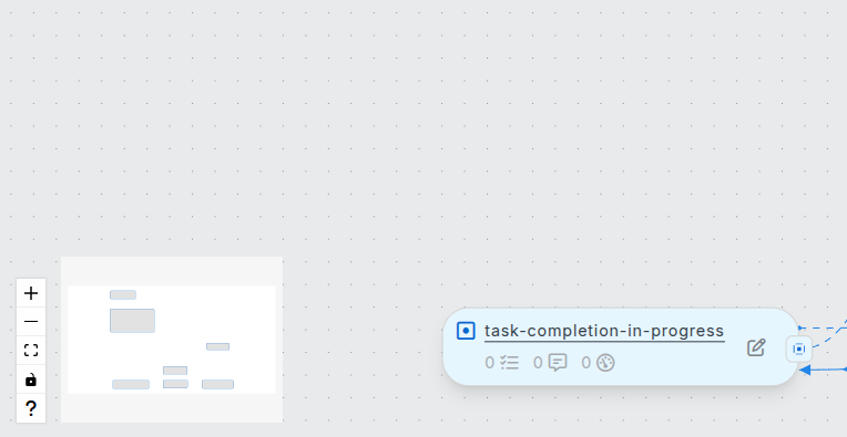
- The Add State button adds a new state to the canvas. States represent stages or checkpoints within a process.
- The Add Action button adds a new action to the canvas. Actions perform tasks or operations within a process.
Navigation Tools
In the bottom-left corner of the canvas, you will find the navigation tools. These tools help you move around the canvas, adjust your view, and access quick controls while building your template.
The navigation tools include the following:
- Mini Map — Displays a small overview of the entire canvas and highlights the section currently in view. You can click anywhere on the mini map to quickly move to a different area of the canvas.
- Zoom In and Zoom Out — Adjust the canvas zoom level for better visibility and navigation.
- Fit to Screen — Automatically adjusts the canvas position and zoom level so that all template elements fit within the visible area.
- Toggle Interactivity — Enables or disables canvas interactivity. This is useful when you want to move around the canvas without accidentally changing states, actions, or connections.
- Help — Opens a guide to the available builder controls and keyboard shortcuts.
Builder controls and shortcuts
Flow Pilot Chat Widget
When you open a template in the Builder, the Flow Pilot window automatically opens with a welcome message, allowing you to immediately start asking questions or requesting assistance.
You can reopen the Flow Pilot at any time by clicking the chat icon in the bottom-right corner of the canvas.

The Flow Pilot Chat Widget is an AI assistant designed to help you while building and editing templates in the Builder.
Using Flow Pilot, you can:
- Ask questions about the Builder and its features.
- Get assistance with creating and configuring templates.
- Request help with prompts and markdown annotations.
- Ask the Flow Pilot to perform actions directly on the canvas, such as:
- Adding states or actions.
- Modifying or configuring existing states, actions, and annotations.
- Deleting states or actions.
- Updating template components and configurations.
Flow Pilot helps streamline template development by providing in-context assistance directly within the Builder.
For more information on Flow Pilot and its capabilities, see the Flow Pilot documentation.
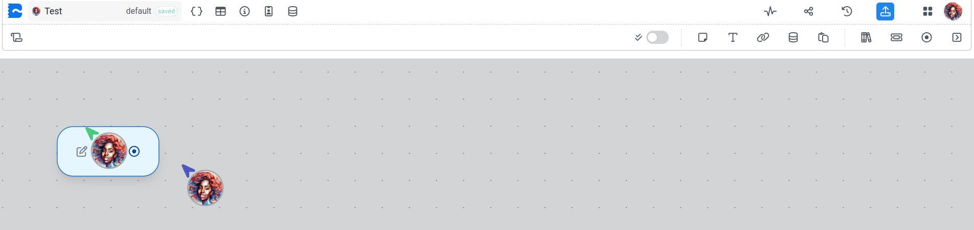
Collaboration
The Builder supports real-time collaboration, allowing multiple users to work on the same template simultaneously.
You can see who is currently working on the template by looking at the top-right corner of the screen, where you will find the user icon and the number of collaborators currently working on the template. You can also view collaborators by clicking or hovering over the user icon.
Autosave
The Builder automatically saves changes as you work, helping prevent accidental data loss and removing the need for manual saving.